Developing games or apps that simulate board games always brings interesting UI challenges. Recently, while creating a version of the classic card game Blackjack in Flutter, I found myself needing a playing card component that was not only functional but also visually appealing and, above all, reusable.
In this post, I’ll guide you through the process of creating PlayingCard, a widget that renders both the front and back of a card, is fully customizable in size, and was the centerpiece of my Blackjack game.
The Structure: Separating Data from the UI
Before drawing anything, the most important thing is to model the data. A good architecture separates the logic (what a card is) from the presentation (how a card looks). For this, I created the PlayingCardModel class.
It uses enum to ensure that suits and ranks are always valid, and it contains the logic to get the string representation (‘A’, ‘K’, ‘10’) and the card’s value in the game of Blackjack.
/// Defines the four possible suits of a deck.
enum CardSuit { hearts, diamonds, clubs, spades }

/// Defines the ranks (values/figures) of a card.
enum CardRank {
  ace, two, three, four, five, six, seven, eight, nine, ten, jack, queen, king,
}

/// Represents the data model for a single playing card.
class PlayingCardModel {
  final CardSuit suit;
  final CardRank rank;
  bool isFaceUp;

  PlayingCardModel({
    required this.suit,
    required this.rank,
    this.isFaceUp = true,
  });

  /// Returns the `String` representation of the card's rank.
  String get rankString {
    switch (rank) {
      case CardRank.ace: return 'A';
      case CardRank.jack: return 'J';
      case CardRank.queen: return 'Q';
      case CardRank.king: return 'K';
      default: return (rank.index + 1).toString();
    }
  }

  /// Returns the numerical value of the card for the game of Blackjack.
  int get value {
    switch (rank) {
      case CardRank.ace: return 11; // Ace is initially 11.
      case CardRank.jack:
      case CardRank.queen:
      case CardRank.king: return 10;
      default: return rank.index + 1;
    }
  }
}
Building the PlayingCard Widget
With the model ready, we can focus on the visual part. The PlayingCard widget receives a PlayingCardModel and a size parameter, which acts as a multiplier to scale the entire card, making it incredibly flexible for different layouts.
The main logic is simple: if card.isFaceUp is true, show the face; otherwise, show the back.
Here is the complete widget code:
import 'package:flutter/material.dart';
import 'dart:math' as math;
import '../models/card_model.dart';

class PlayingCard extends StatelessWidget {
  final PlayingCardModel card;
  final double size;

  const PlayingCard({super.key, required this.card, this.size = 1.0});

  // Getter for the suit's visual details (icon and color).
  Map<String, dynamic> get _suitDetails {
    switch (card.suit) {
      case CardSuit.hearts: return {'icon': '♥', 'color': Colors.red[700]!};
      case CardSuit.diamonds: return {'icon': '♦', 'color': Colors.red[700]!};
      case CardSuit.clubs: return {'icon': '♣', 'color': Colors.black};
      case CardSuit.spades: return {'icon': '♠', 'color': Colors.black};
    }
  }

  @override
  Widget build(BuildContext context) {
    return card.isFaceUp ? _buildCardFace() : _buildCardBack();
  }

  /// Builds the widget representing the card's face (rank and suit).
  Widget _buildCardFace() {
    final details = _suitDetails;
    final String rankText = card.rankString;
    final String suitIcon = details['icon'];
    final Color suitColor = details['color'];

    final cardWidth = 70.0 * size;
    final cardHeight = 100.0 * size;
    final cornerFontSize = 16.0 * size;
    final centerFontSize = 35.0 * size;

    return Container(
      width: cardWidth,
      height: cardHeight,
      decoration: BoxDecoration(
        color: Colors.white,
        borderRadius: BorderRadius.circular(8.0 * size),
        border: Border.all(color: Colors.black, width: 0.5 * size),
        boxShadow: [
          BoxShadow(
            color: Colors.black.withAlpha(51), // ~20% opacity
            spreadRadius: 1 * size,
            blurRadius: 3 * size,
            offset: Offset(1 * size, 1 * size),
          ),
        ],
      ),
      child: Stack(
        children: [
          // Top-left corner
          Positioned(
            top: 4 * size,
            left: 5 * size,
            child: _buildCorner(rankText, suitIcon, suitColor, cornerFontSize),
          ),
          // Bottom-right corner (rotated)
          Positioned(
            bottom: 4 * size,
            right: 5 * size,
            child: Transform.rotate(
              angle: math.pi,
              child: _buildCorner(
                rankText,
                suitIcon,
                suitColor,
                cornerFontSize,
              ),
            ),
          ),
          // Center suit icon
          Center(
            child: Text(
              suitIcon,
              style: TextStyle(fontSize: centerFontSize, color: suitColor),
            ),
          ),
        ],
      ),
    );
  }

  /// Builds the widget representing the card's back.
  Widget _buildCardBack() {
    final cardWidth = 70.0 * size;
    final cardHeight = 100.0 * size;

    return Container(
      width: cardWidth,
      height: cardHeight,
      decoration: BoxDecoration(
        color: const Color(0xFF1E3A8A), // Dark blue
        borderRadius: BorderRadius.circular(8.0 * size),
        border: Border.all(color: Colors.white, width: 1.5 * size),
        gradient: LinearGradient(
          colors: [const Color(0xFF2563EB), const Color(0xFF1E3A8A)],
          begin: Alignment.topLeft,
          end: Alignment.bottomRight,
        ),
        boxShadow: [
          BoxShadow(
            color: Colors.black.withAlpha(77), // ~30% opacity
            spreadRadius: 1 * size,
            blurRadius: 4 * size,
            offset: Offset(1 * size, 1 * size),
          ),
        ],
      ),
      child: Center(child: _buildCircularSuitPattern()),
    );
  }

  /// Creates the circular pattern with the 4 suits for the card's back.
  Widget _buildCircularSuitPattern() {
    final suits = ['♥', '♦', '♣', '♠'];
    final radius = 18.0 * size;
    final iconSize = 19.0 * size;

    return Stack(
      alignment: Alignment.center,
      children: List.generate(suits.length, (index) {
        // Calculate the angle for each suit (0, 90, 180, 270 degrees).
        final angle = index * (math.pi / 2);

        // Use trigonometry to calculate the (x, y) position on the circle.
        final x = radius * math.cos(angle);
        final y = radius * math.sin(angle);

        final suitColor = Colors.white.withAlpha(153); // ~60% opacity

        return Transform.translate(
          offset: Offset(x, y),
          child: Text(
            suits[index],
            style: TextStyle(
              fontSize: iconSize,
              color: suitColor,
              fontWeight: FontWeight.bold,
            ),
          ),
        );
      }),
    );
  }

  /// Builds the card's corner widget (rank and suit).
  Widget _buildCorner(String rank, String suit, Color color, double fontSize) {
    return Column(
      children: [
        Text(
          rank,
          style: TextStyle(
            fontSize: fontSize,
            fontWeight: FontWeight.bold,
            color: color,
          ),
        ),
        Text(
          suit,
          style: TextStyle(fontSize: fontSize * 0.8, color: color),
        ),
      ],
    );
  }
}
Visual Implementation Details
Some interesting points in the UI construction:
- Symmetrical Corners: To create the classic card look with the value on opposite corners, I created a
_buildCornerwidget and, for the bottom-right corner, simply rotated it 180 degrees (math.pi) with aTransform.rotate. Simple and effective! - Stylized Back: Instead of a solid color, I used a
LinearGradientto give depth to the card’s back. - Trigonometric Suit Pattern: The coolest detail on the back is the circular pattern with the four suits. Using a
Stackand a bit of trigonometry (cosandsin), I positioned each icon in a perfect circle.List.generatecreates the 4 icons, andTransform.translatepositions them based on the calculated angle.
The Result in Action
To see the PlayingCard component in a real project, there’s nothing better than a functional game. I created a simple web version of Blackjack that demonstrates how the cards are dealt, flipped, and arranged on the screen.
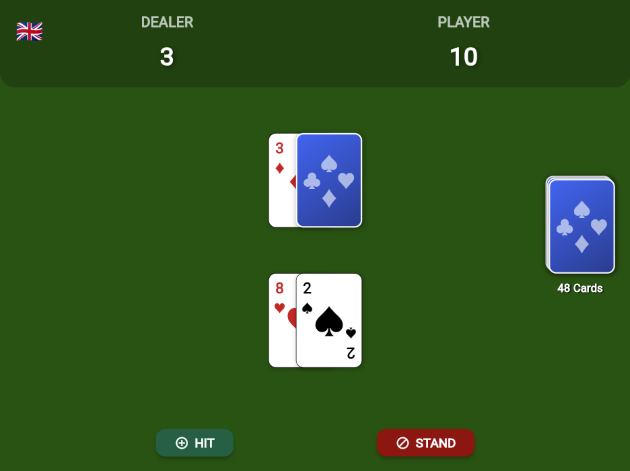
You can play it directly in your browser:
Conclusion and Source Code
Creating UI components from scratch in Flutter is an extremely rewarding exercise. With PlayingCard, we have a flexible widget with a clean API and a polished look, ready to be used in any card game.
If you want to explore the complete source code of the Blackjack game to see how PlayingCard was integrated, or simply use the component in your own projects, the repository is open on GitHub.
Access the full repository on GitHub here!
Feel free to clone, open issues, suggest improvements, or give it a star if you found the project useful!